The setting for each widget allow you to change the inputs, control the axis for a metric, toggle between different types of charts, and alter the color scheme.
-
Basic / Quantitative Charts
-
Vertical and Horizontal column charts:
The timeless and infinitively adaptable tool of the data visualization, the vertical and horizontal column allow comparison of trends over time and segments. The widget setting enable changing comparison period / segments as needed.
-
Line chart
A graph that can visualize data in the form of a line, making it easy to understand the performance of each group over time.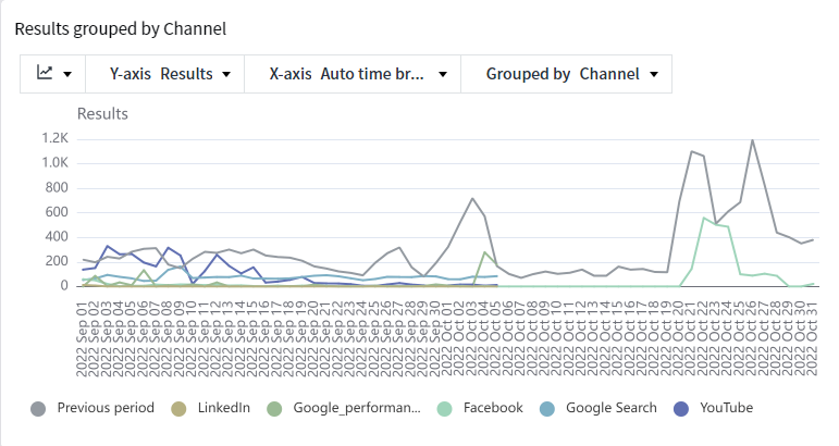
-
Combo chart
Combine the benefits of line and bar graphs to overlay trend; allows comparison of 3-4 categories.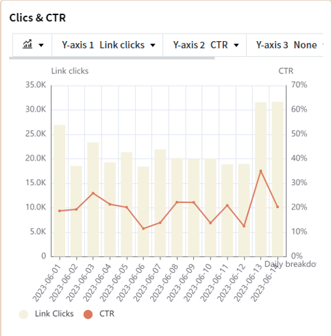
-
Scatter plot:
Effective format for comprehending the interplay between various indicators and understanding their relationships.
-
Pie Chart and Donut Chart
These chart presents the relative proportion of each component in relation to the entirety, with a particular focus on examining the ratio of advertising costs allocated across different channels.
-
-
Creative Charts
-
Word Cloud
The Word Cloud chart provides insights into the effectiveness of words utilized in ad copy. Frequently used phrases appear larger in size, while less common phrases appear smaller. Moreover, phrases with excellent performance are displayed in blue, while those with poorer performance are depicted in orange or darker colors. It's important to note that if only images are employed without any accompanying text, the word cloud may not display data. The drop down in the top=left hand corner can be used to change the inputs.
-
Color Clustering
Color Clustering: The Color Clustering chart illustrates the performance of individual colors utilized in creatives. Data is visually represented by selecting one representative color per element. Since the most prevalent color is determined by analyzing pixel units, the extracted color may differ from what is perceived as the dominant color by the naked eye.
-
Emoji Analysis
The Emoticon Analysis chart presents the performance of each emoticon incorporated in ad copy. The size of the emoticon varies based on its frequency of use. This chart format is often consulted by the content team and creative planning team when crafting advertising text.
-
Funnel Charts
The Funnel Chart showcases the conversion rate and exit rate by organizing user behavioral events in a step-by-step manner. Its primary purpose is to visualize the performance of events that are interconnected in a sequential manner.
-